If you could travel back in time to the year 2000, you would find that only about 20% of Americans had made a purchase online. Times have obviously changed. Today, you would find that roughly eight in ten Americans are online shoppers.
Yet, why do so many of us like to shop online? One of the main reasons is the convenience of online shopping. It’s easier than physically going to a store. Shoppers can avoid long lines, travel, and crowded spaces. Many also believe that they may get a better price online, or that prices would be easier to compare navigating to different sites instead of staying in one store.
Because online shopping is a convenience to shoppers, they also expect eCommerce stores to be easy to use, but that’s just part of their requirements. High competition and security concerns have pushed shoppers to ask for much more. Let’s discover below what they really expect.
1. Social Proof: Reviews, Social Media, and More
“I’ll have what she/he is having.” This very common phrase helps illustrate what social proof is, which states that we make our decisions based on the decisions of others. As social beings, we actively seek other people’s feedback to validate our own. It helps to minimize doubts surrounding purchasing decisions and allows us to gain more confidence in the company and product. Used effectively, social proof can also be a key component in your social media strategy.
Thanks to the popularization of online social proofs like reviews, shoppers expect them more than ever before. They want to make sure they are shopping in a secure store with reliable products. They also seek reviews to gain an insider view of the product’s fit, use, and, most importantly, quality.
Note that not all reviews have the same weight. The reviewer plays an important role influencing a potential customer. A review from an industry expert will be more persuasive than a review from an unknown person. Also, reviews from friends and family will be considered more valuable than reviews from unknown people. That’s why social media platforms like Facebook have features that say “your friend <insert name> likes this>.
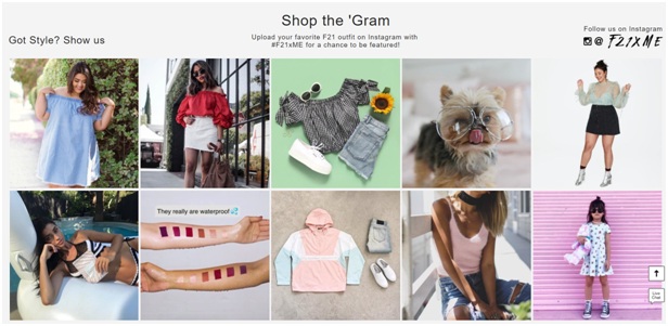
There are many other ways besides reviews to show social proof. One of them is showcasing a social media feed. As you can see below, Forever21 uses an Instagram feed to not only show their user generated content but, also, to allow people to shop the looks from their social media account.

Showing your number of followers or subscribers is another way to social proof. Some retailers show these numbers to encourage others to like them or social media or to join their newsletter list. Whether you use one way or all of them combined, make sure they are visible to every user.
2. Visual Appeal Through Good Design
eCommerce design is very different from other types of designs. Unlike other designs that are just built to be pretty, eCommerce designs have to be visually appealing, interactive, and user-friendly. They also have to enable customers to have a good user experience or UX in different mobile devices and screen sizes.
If your eCommerce store lacks a user-friendly design, it can put you at a disadvantage with your competition. In addition, an appealing design can help your online store look more established and trustworthy. An old, disorganized, or outdated design is like have an old, dusty, and dirty brick and mortar store—it can scare customers away.
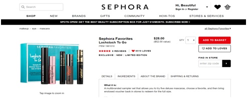
When optimizing your design, think about product organization and what sections you’d like to highlight. Colors and different sizes can be used to purposely highlight important sections of your store or product pages. This idea is often used to highlight “buy now” buttons. For instance, see how Sephora highlights their action button and reviews with a bright red color.

The contrast in colors helps draw the eye to the “add to basket” button and the star reviews. Good design can also help the site look more organized and put together. If we took the same design you see above and reduced the white space and use multiple different font sizes and styles, that pretty product page would turn unappealing. We’ll discuss more about the importance of organization in the next section.
3. Neat and User-Friendly Organization
Displaying products in an organized manner is not enough. You have to think of your target users and how they will interact with your site. Having their purchasing behavior in mind will help you prioritize specific product categories and indicate how to showcase filters and options that can ease the purchasing process.
For instance, some retailers that get a lot of traction from Instagram choose to prioritize in their menu a “Shop the Insta” link where their users can purchase products featured on their Instagram account. Others opt for more traditional navigation menus that are classified by categories, which is also okay. Whatever is best for your customer is the right answer.
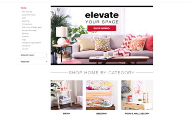
Once a user clicks on a selection on the main menu, think what will happen next. Are you going to have intermediary category pages like the one below, or just have sub selections?

TJ Maxx uses the intermediary category page above to guide users to the right products in the home selection. Another factor to keep in mind when organizing your categories is your inventory size. If you have a big selection of products, your users may benefit from very detailed filters; otherwise, they may get tired of browsing multiple pages to find items they are looking for.
4. Personalized Product Recommendations
Product recommendations serve as a tool to provide user guidance and allow for the discovery of new products. Although customers may not know their proper name, or how they work, chances are they have seen them before. They are very common to find on Amazon, where there are a variety of product recommendations according to different algorithms. Amazon has previously stated that 35 percent of its product sales result from these product recommendations.
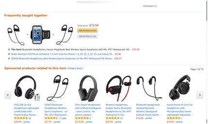
Use them to cross-sell and upsell products on product pages. See how Amazon does both in this headphones product listing:

The top recommendation is cross-selling by suggesting complementary products. The bottom product recommendation is trying to upsell and show me different headphone options to choose from.
Final Thoughts
Having your target customers in mind, and understanding their expectation and shopping behaviors, will help you optimize your eCommerce store. Use these tips to guide you through the process.
Author Bio:
Ron is the Chief Marketing Officer and Co-Founder of Visiture. He is supported by a team of creative geniuses that strive to help clients achieve new levels of success. His passion is helping eCommerce business owners and marketing professionals navigate the search marketing landscape and use data to make more effective decisions to drive new traffic and conversions. Follow me @Visiture_Search

